Friday, November 27, 2009

Quaint Savannah

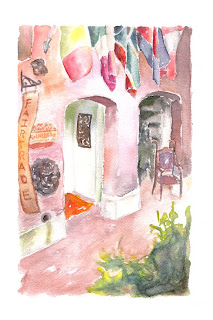
These were my final assignment in my Watercolor Techniques class. We had to illustrate what we thought best represented Savannah, GA in a full page and spot illustration. I chose to emphasis the quaint feel of Savannah streets and the small, privately owned stores. I finally nailed the technique that my professor had been striving to teach me, particularly in the full page illustration. I have never done foliage before, and clearly need some work in that area, but for a first attempt at painting a "landscape" of Savannah in this style I am rather pleased.

Tuesday, November 24, 2009

Twisted Abe


This was my final for Editorial Illustration. Our assignment was to illustrate an article in Atlantic Monthly about honesty versus integrity. I thought the idea of "honest Abe" (Abraham Lincoln), an icon for honesty, being completely twisted was a creative interpretation of the article and would give the idea that honesty is not always enough or can have twisted intentions and lack of integrity. Done completely in photoshop with my own brushes in an attempt to digitally create the feel of watercolors or chalk pastels.

Wednesday, November 4, 2009

Pumpkin Doughnuts in Autumn

This was a part of the same illustration assignment, but to do a spot illustration for an article about autumn activities, specifically playing football in Central Park of going to the Cupcake Cafe in NYC to get delicious Pumpkin Doughnuts- I chose to illustrate the latter, as I love pumpkin-anything. I chose a similar color palette to One Thousand Frogs, the other illustration in this assignment, because I felt it reflected the atmosphere of autumn. This was also done completely digitally with Photoshop CS4 in an attempt to mirror the style of watercolor.
My search for reference images for this illustration has also inspired me to bake something with pumpkin in it.

Tuesday, November 3, 2009

One Thousand Frogs, One Prince

This was an assignment for my Editorial class to do a quarter page illustration for an article about the dating scene in New York and how one has to "kiss one thousand frogs before one finds the prince." This is a new color palette for me and I really like it- it reminds me of fall, which is my favorite season. I wanted to try working with a limited pallet, since I often use very bright, vivid colors, and this was surprisingly not too challenging to narrow my pallet down. This was also done completely digitally in Photoshop CS4.

Sunday, October 25, 2009

Theater Poster


Though the season is not midsummer, the poster focuses on a certain play that takes place in "A Midsummer Night's Dream."
That's right, this was a poster assignment to illustrate a poster of any kind of performance, and since this particular Shakespearean play has had such a huge role in my life I decided to do this.
I have been working and struggling very hard with watercolors in this class- learning a complete new technique and style of painting, very different from my own "style." At first, I would always "pet the paper", as my teacher phrased it, and would never be bold enough or dark enough with my watercolors, so I really worked at simply putting down the paint and leaving it, as well as blending it and having a range of values.
Though it is not, in any way, my favorite piece that I have produced, I am quite proud of my progress in the class, and hope that I continue to take as giant steps in growth as I have been.

The figure on the rocks is, by far, my favorite character- Puck. This does not quite embody how I always imagine him, but it does capture the "essence" that I feel is always carried with him. The carefree, mischievous, wild and yet, at times, gentleness that is Puck. Enjoy!
Thursday, October 22, 2009

"Money Cover"


This was my most recent project in my Editorial Illustration class. Our assignment was to illustrate the cover of Money Magazine, specifically an article in the magazine dealing with the resurgence of "Main St." in small towns.

This was all done digitally and actually started out as my rough color comp just to figure out positioning and color schemes. It is relatively different from the work I typically produce, especially because it is digital and I am such a traditionalist in my art, but my class seemed to like it, so maybe I will have two styles? I don't know.

Anyway, I hope you enjoy it and that I learn to like it myself. But really, in the Illustration field, as long as the client is happy in the end, it pays for bills! Right?

Friday, October 16, 2009

Blogging?

I'm going to attempt to blog every so often with updates on my art-production status and what I have been working on recently, both for class projects as well as my own art done in addition to schoolwork, My goals, in doing this, will be to attract more attention to my artwork and, basically, put my name out there and become better known as an illustrator.

My current goal is to get my website up and running, as well as design some sort of illustration for the header of my blog. I'm still slightly confused about the set up of blogs as well as the idea, as this is almost completely new to me, but I will catch on.

Until next time!

~Liz